Three identity directions
Kaspack identity concepts.
One packaging brand. Three ways to express it. Compare the symbols, colours and applications, then explore each presentation.
Choose a direction.
Each concept follows the identity from its core mark to stationery, packaging tape, cartons and display banners.
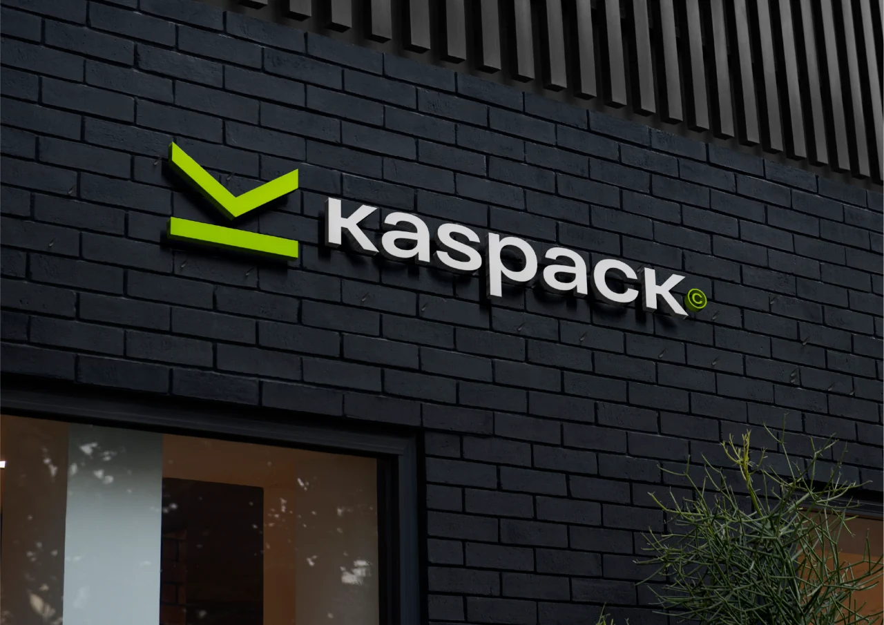
Lime identity concept
An open-box symbol and vivid lime colour connect the identity to packaging and logistics.
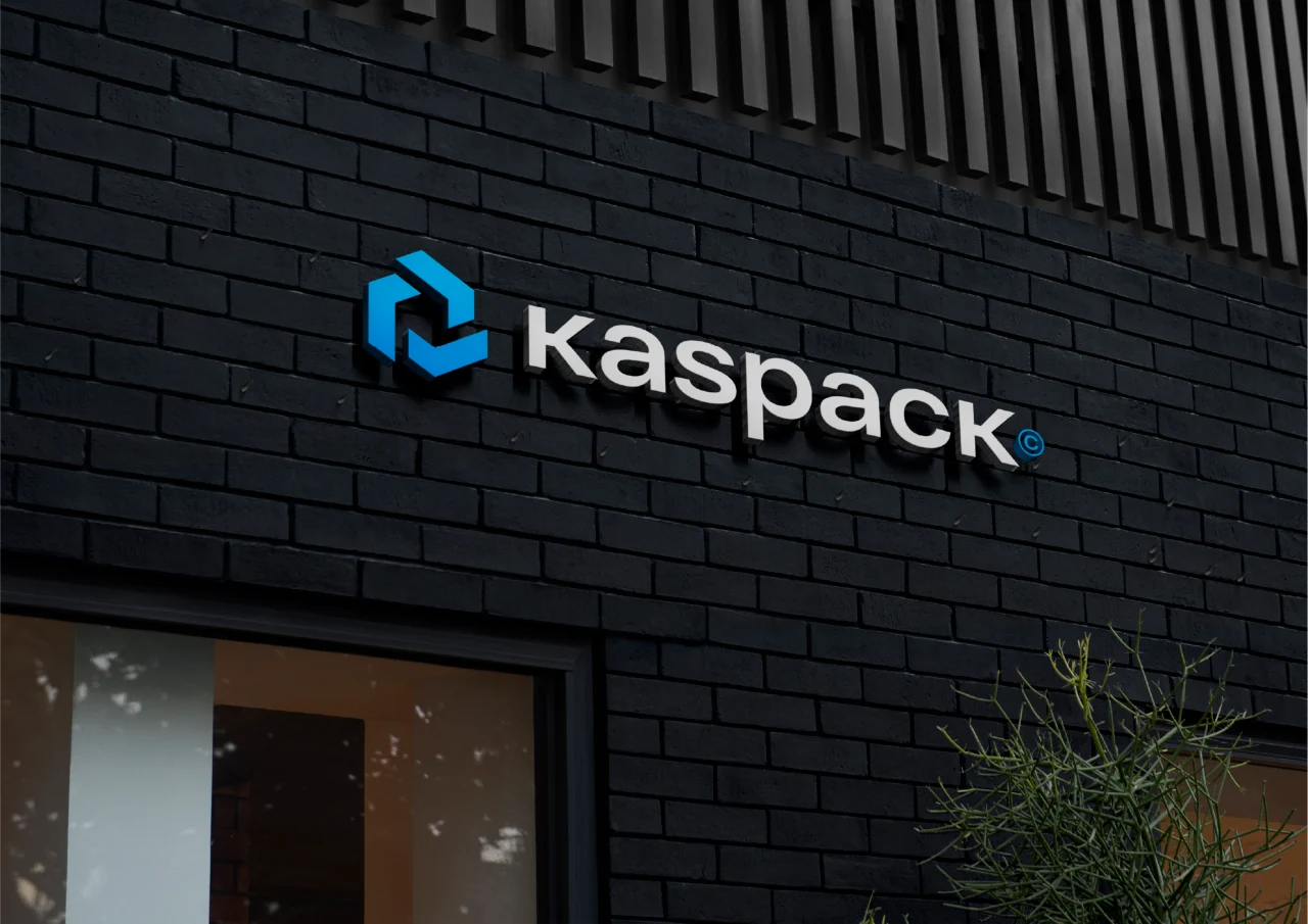
Blue identity concept
A blue geometric symbol develops Kaspack’s existing packaging identity into a consistent application system.
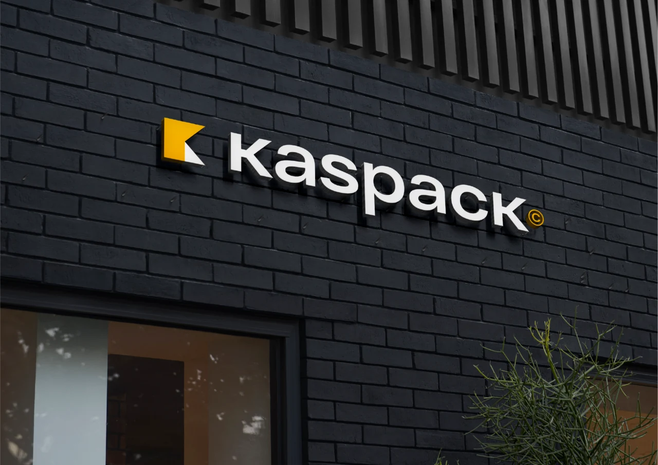
Yellow identity concept
A folded yellow K becomes a bold graphic device across the packaging brand’s touchpoints.